YOUCHOOSE MOBILE APP: YouChoose is a tool to help special needs students reach their education milestones.
USER RESEARCH: To understand the pain points and needs students, teachers, and parents face with the special ed system, I conducted interviews and facilitated a design workshop at a special needs organization.
SYNTHESIS: I used the data i had collected to uncover key user insights, which I used to inform personas and user journey maps.
PERSONAS: Because I wasn't working with a team, it was crucial to have a set of personas to use as guide during the process. I was able to refer back to them and make sure that my design decisions were grounded in empathy for the user.
JOURNEY MAPPING: The journey maps helped me to identify pain points and opportunities for each of the users.
IDEATION: After crafting How Might We statements, I brainstormed and ideated different concepts.
CONCEPTUAL MAPPING: Working with conceptual mapping helped me make sure that I was designing for user goals, not just designing features arbitrarily.
SKETCHING LAYOUTS: Sketching in low fidelity let me iterate the designs rapidly and allowed me to identify the functional elements needed to create a minimum viable product.
YouChoose
PROJECT TYPE: Designing for Accessibility
TIME FRAME: 4 weeks
COLLABORATORS: Individual
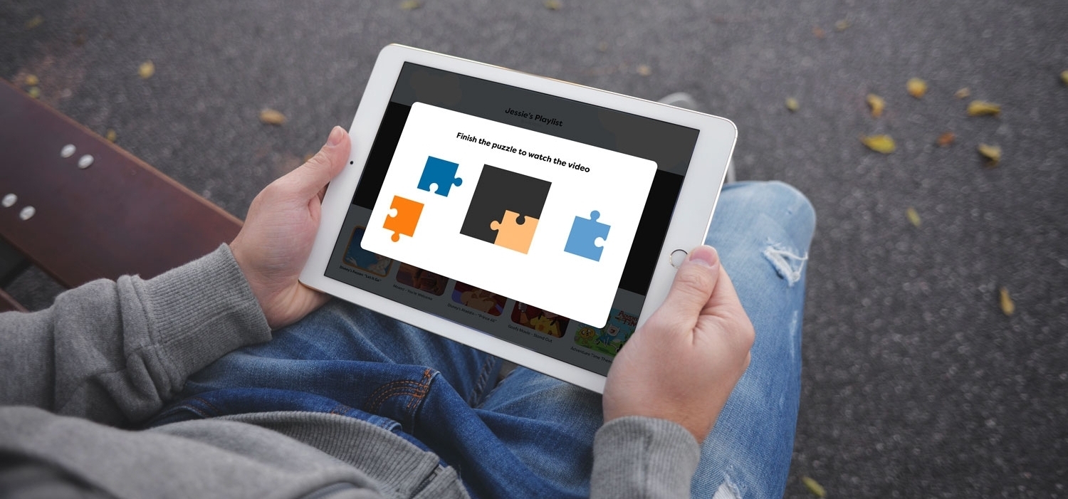
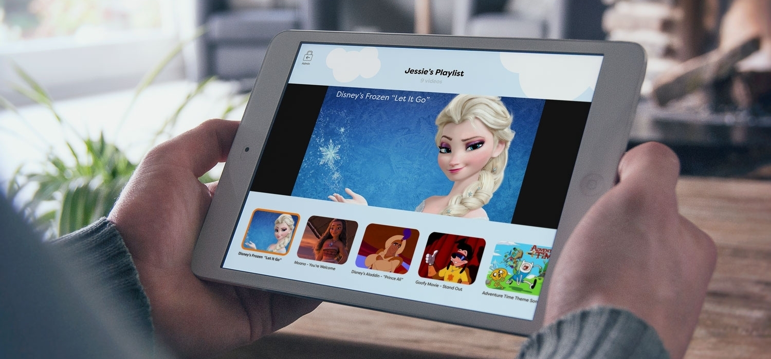
YouChoose is a tool to help special needs students reach their individual education milestones. Teachers and parents can create custom video playlists, which students can unlock by completing quick cognitive or physical therapy activities.
PROBLEM
Special needs education is built on helping students reach individual milestones rather than following a pre-set curriculum. This system is effective, but requires a lot of time and effort from parents and teachers to be successful. It also requires extended focus from the students, which can be challenging for many of them.
Is there a way to improve the experience students, teachers, and parents have with the special ed system?
MY PROCESS
I started this project by learning as much as I could about special ed and the needs of students, teachers, and parents in that ecosystem. So I visited a special needs respite facility for a full weekend where I was able to conduct interviews with the staff and parents. The interview format wasn't really successful with the students, so I facilitated a design workshop where they could express themselves better through collaborative activities.
I synthesized the data I had gathered to create personas and journey maps, which helped keep my process grounded in empathy for the users. I crafted how might we's and ideated solutions until I developed the integrated lesson framework that would become YouChoose.
I built conceptual maps based on user goals to establish the app's features and architecture. Then I sketched layouts on note cards so I could rapidly iterate designs. I also made a style guide as a reference so my visual designs would account for accessibility requirements. After building an interactive prototype, I went back to the special needs organization to conduct usability testing. I used their feedback to make changes and develop the app's final design.
LEARNINGS
This project helped to reinforce just how important accessibility consideration are when designing. For these students, a minor change in color or font could prevent them from learning a crucial concept in class. Seeing that impact first hand made sure that I'll keep those considerations in mind during future projects.
WANT TO LEARN MORE?
Check out my in-depth case study
ACCESSIBILITY GUIDE: A high percentage of special needs students have accessibility requirements relating to color blindness. I found a color palette that was visible to the vast majority of color blindness varieties.
INTERACTIVE PROTOTYPING: I built an interactive prototype using Sketch and Principle so I could test my design decisions. I built this version with larger UI elements to make it easier for students with dexterity disabilities to use.
USABILITY TESTING: I went back to the special needs organization to get feedback on my prototype. The biggest realization was that the teacher would always activate the app, so I needed to change the user flows to reflect that.
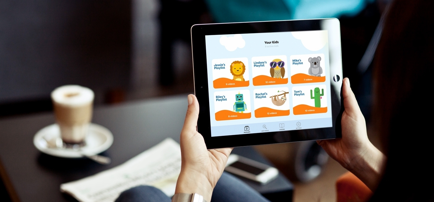
FINAL VERSION: The usability testing led to some significant changes in the final design. The admin flow became the home page, where the teacher or caregiver could select the playlist for the specific student they're working with. I also changed the visual feel to be more friendly and playful, but not childish.


