COAT CHEQ: A jacket rental service designed using the sharing economy model. The system contains three components: the app (picture above), an interfaced locker, and instrumented jackets.
RESEARCH: I conducted interviews to discover user needs and goals. I was also able to informally gauge interest in a service like this and make sure that people would be comfortable sharing jackets. The response was positive, but it would require testing later for actual validation.
USE CASE STORYBOARDS: I synthesized the data I had gathered to create provisional personas. Each persona had distinct goals and behaviors, so I made storyboards to visualize how those goals would translate into use cases.
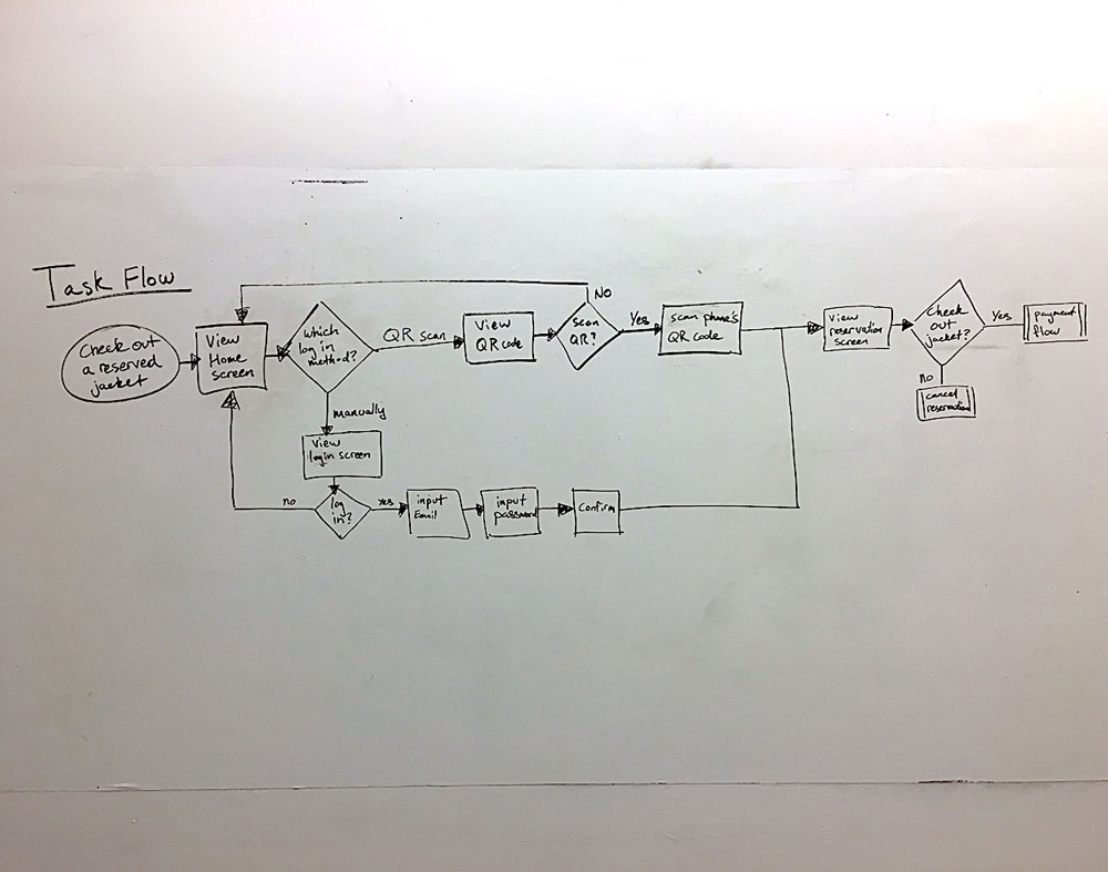
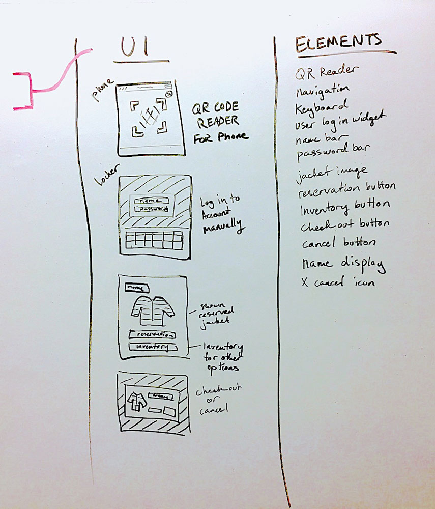
FUNCTIONAL DESIGN: I converted the storyboards into user stories, which acted as a guide to develop task flows and rough UI layouts. Those pieces allowed me to identify what UI elements were needed on each screen so a user could complete their goals.
Coat Cheq
PROJECT TYPE: Experience Design
TIME FRAME: 3 weeks
COLLABORATORS: Individual
In this project I addressed the classic SF problem of needing to carry a jacket at all times. Coat Cheq is a jacket rental service designed using the sharing economy model.
Problem
Having to bring a jacket with you everywhere is a daily hassle of SF life. If you don't have one with you and the fog rolls in, you only have two options: buy a new piece of clothing or end things early and head home. Is there a way to provide people with a third option that would improve the experience of being in San Francisco?
My Process
I approached this project using the Lean startup methodology, developing an initial hypothesis that could be rapidly developed and tested. I started by conducting interviews to confirm that a jacket sharing service would be desirable and that people would be comfortable with the concept of sharing clothing. During the interviews, I was also able to identify user pain points and needs.
I used that data to work through the functional design process, to keep my decisions focused on user goals. This process helped me develop the task flows and UI elements necessary to test the product's core functionality.
With the content from the functional design, I developed an interactive prototype for both the app and the locker screen. I also iterated on form factors for the locker, and built a 3D mockup to get a better idea of how people could interact with it in the real world.
Learnings
My biggest takeaway from this project was how to keep focus on the essentials when operating on such a tight timeline. I really had to trust in the design process, and that It would act as a guide to help me work efficiently and stay within the project scope.
If I could expand the project into next steps, I'd like to complete the lean startup practice by actually implementing a minimum viable product and develop the metrics for testing it.
Want to learn more?
Check out my in-depth case study
IDEATION: Using the functional design content as a guide, I sketched on paper to rapidly ideate and iterate layout designs for the app and locker screens. This saved me time by working in low fidelity rather than trying to figure things out in Sketch and Principle.
INTERACTIVE PROTOTYPE: One of the main components I needed to test with my app prototype was the the initial screen. I built it as a proximity map because a key user insight stated that time to get out of the cold was a higher priority than the distance to get there. The feedback I received was positive though, so I kept it in the final design.
PHYSICAL TOUCHPOINT: I had completed the design for the locker screen, but I needed to design the form factor for locker itself. I iterated on designs until I found a form that balanced the user and business needs I had uncovered earlier in the project.


