Territory Planning
Summary
Redesign of the core navigation and content management experiences for Salesforce Maps Territory Planning. Full overhaul of UX, UI, and backend - with a focus on bringing the feature up to accessibility standards.
My Contributions
I was the only designer on this project. All design decisions, assets, etc were from me. I also acted as subject matter expert for accessibility
Context
Project summary
This product had been launched and growing for two years, and all the added features led to serious UX debt and a confusing experience for users. The leadership team decided to do a full overhaul, with one important requirement: it had to maintain functional parity with the existing product. If people suddenly lost access to old features or functionality, it might cripple their business.
What is territory planning?
Territory Planning is a part of Salesforce Maps where companies can divide up territories for sales and service teams. It’s how companies assign work and quota to reps using geography rather than in data tables like the rest of Salesforce.
Main components:
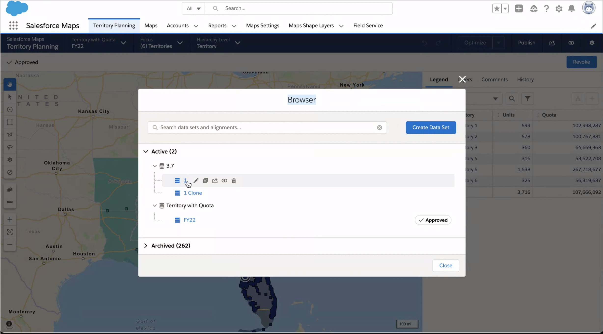
The browser: Landing page for user. How they manage and select data sets and alignments
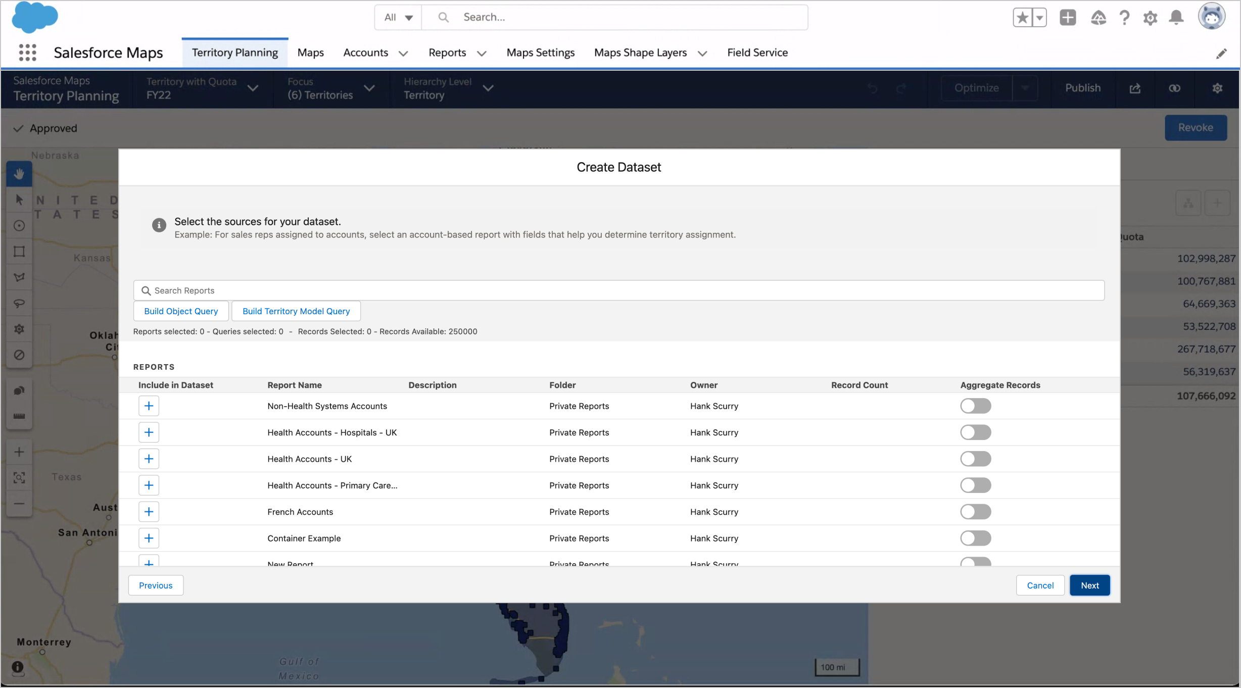
The creation wizards: How they make and edit data sets and alignments
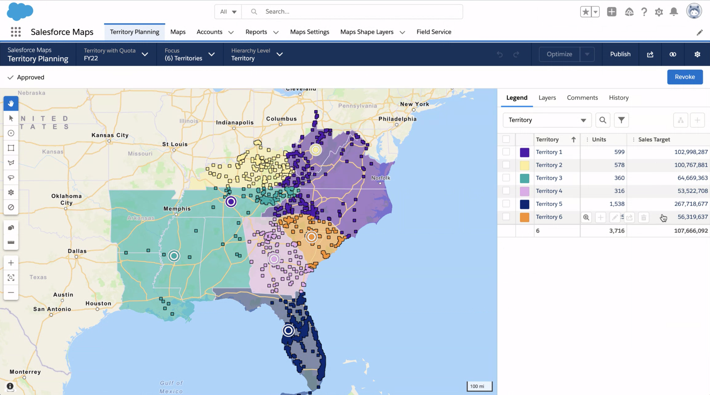
The builder: Map view tool once the users have set up their data
Problem
Users land on a selection modal that has no preview function, so they may pick something, wait forever for it to load, and then see it’s the wrong plan. There’s no thumbnail, matadata, recently viewed sorting, etc. This makes the experience extremely frustrating. The core experience needs to be revised so users can find the plans they want quickly and easily.
Pain Points:
Users can’t easily find the alignment/data set they’re looking for
Only way to see if they have selected the right choice is to load the builder
Loading an alignment can take up to 5 minutes. If they made the wrong choice, that’s frustrating
Project goals
Redesign the browser into a “content management system” style experience with a home screen
Allow for robust search and browse experiences
Give users information about what is happening in TP for their org as a whole, and about individual records
Understand and Define
The beginning of this project was classic double diamond process.
We had an existing product - so we had to break everything down, restructure it, and build it back up.
Impact analysis
We started with a check of all products and features in Salesforce that had data connections to Territory Planning. We needed to find out what could be affected by changing our product, how, and if we needed to add design requirements to avoid conflict.
Audit of the existing product (user flows)
We did an audit of the existing Territory Planning flows to make sure we were capturing the full scope of the redesign. It also helped us understand what areas would have to be examined in greater detail.
Audit of the existing product (features and interactions)
For each section we documented in the user flows, we did an in-depth audit to ensure we could maintain functional parity with our new design.
It’s not fancy, but sometimes a bullet point list is the best tool for the job.
Information architecture
Now that we’d broken everything down into atomic components, we restructured the information architecture into a more intuitive system.
Cognitive mapping
We detailed out each page from the information architecture using cognitive mapping. With this method we were able to ensure that we maintained parity with the existing product and could streamline user flows into the most intuitive paths possible.
Designing and Iterating
Inspiration from other design sources
To start the build phase of the project, I collected and examined possible design patterns for inspiration.
Internal: I wanted to see if there were existing patterns within Salesforce that could be leveraged (to save time and engineering resources)
External: I focused on products that had robust content management systems (Invision, Asana, etc)
Sketching and wireframing
Now that we had all the information for what we were going to build, and some possible patterns from the secondary research, we conducted a whiteboarding workshop to quickly iterate on designs for layouts and components.
Lo-fi mocks
I hit a wall with my first set of lo-fi mocks. They just weren’t working. The hierarchy in the layouts wasn’t clear once information was actually being displayed. So I looped back to the previous phase until I found a new direction.
Lo-fi Mocks round 2
This new version resolved a lot of the issues from the first set of mocks. The navigation and search made more sense, the hierarchy was clear, and it would be closer to existing Salesforce patterns that customers were familiar with.
It would also be better for keyboard navigation and screen readers.
Component design
With the macro decision complete, I zoomed in to work on the design of individual components. One example was the content cards. They had to be designed with a dual purpose. 1) So users could distinguish between alignments at a glance (2) they could examine the cards for more in-depth detail.
4 required interactions:
Inform the user of what alignment they are selecting
Allow them to go to the alignment details page
Take them to the builder experience (launch builder)
Allow them to edit/delete/clone the alignment)
Usability testing
We finished our hi-fi mocks and pulled a prototype together to conduct a set of usability testing. The feedback showed our design assumption were correct, and all users were able to accomplish 100% of the task flows. The only revisions we needed to make was for some of the UI text.
UI Text review
I conduct a UI text review with the doc writer for each of my projects. Each component is broken down with a final audit, documenting any changes that might be required.
Final Designs
After final checks from the doc team and the accessibility team, we packaged up the designs for handoff to the engineers.
The final designs met our overall goals, giving users a much easier time navigating the product, and understanding what actions they should take. It also closed the accessibility gaps from the old project, with the layouts and header structure optimized for keyboard navigation and screen readers.
Effect on Salesforce’s business
29.3% increase in daily active users
34.84% increase in unique users


