Revenue Growth with the LinkedIn Checkout Page
Project Overview
This was a large scale growth initiative to increase revenue by $100 million by improving user conversion rates on the LinkedIn checkout page. This case study will show how we approached the overarching effort and then will deep-dive into one of the experiments (redesigning the order summary component).
Business Impact
In the first four months, completed work is estimated to result in $48 million revenue uplift. More revenue is expected from in-flight projects.
My Contribution
I was the solo designer for all the experiments over the course of this project.

Context
What Was the Project?
LinkedIn launched an initiative to grow revenue by $100 million dollars by making changes to the checkout experience.
The risk to existing revenue flow was too high to attempt a full redesign of the experience - so instead, we are conducting a series of fast follow experiments that can be tested quickly and ramped to GA if successful. Through improvements to conversion rates and creating additional revenue streams, the project has been hugely successful.
This is an ongoing project, but the completed experiments are estimated to bring in $48 million. Additional experiments are currently being developed and tested to continue towards that $100 million dollar goal.
How Was the Project Run?
To move quickly and efficiently, a tiger team was put together that included:
Product manager
Product marketing manger
Engineering lead
Design (me).
We identified and analyzed customer pain points, friction points, and areas of possible growth to create a list of potential changes to run as experiments.
We also identified the limitations for the experiments based on constraints from the rest of the system (entry points, different SKUs, backend database structure, etc).
Strategy
We created a list of 30 experiments and prioritized them based on potential impact for revenue growth vs effort to create and implement. Because this was a cumulative effort, we wanted to make sure there was a mix of small and large bets.
We then created a timeline for design, UXR testing, engineering build time, and ramp to users for A/B testing. And depending on the results, when to bring the new feature to GA release.
These were all fast follow experiments, so on average each of them had 2-3 weeks of UX development before handoff to engineers.

Scope of Work so Far
So far we’ve completed 9 experiments that are in various stages of the testing journey. Some are still being built, some are launched and being monitored for usage. The content ranged from full component redesigns to copy changes.
Some examples:
Redesigning the order summary section
Adding a quarterly billing option (as a third option to monthly and yearly)
Adding additional payment methods like Apple Pay and Pay by Bank
Copy changes to trust badges and “cancel subscription” disclaimers


Experiment Deep Dive:
Order Summary Redesign
Summary
As you can see, this wasn’t a traditional project with one large output. So for this case study, I’m going to walk through one of the experiments to give an idea how each of them was conducted. It was a fast-follow experiment with a quick turn-around time, only two weeks from start to handing off specs to the engineers. So the process had to balance design rigor and speed, with the knowledge that the end result would be tested with live users and iterated on if successful.
What Was This Experiment?
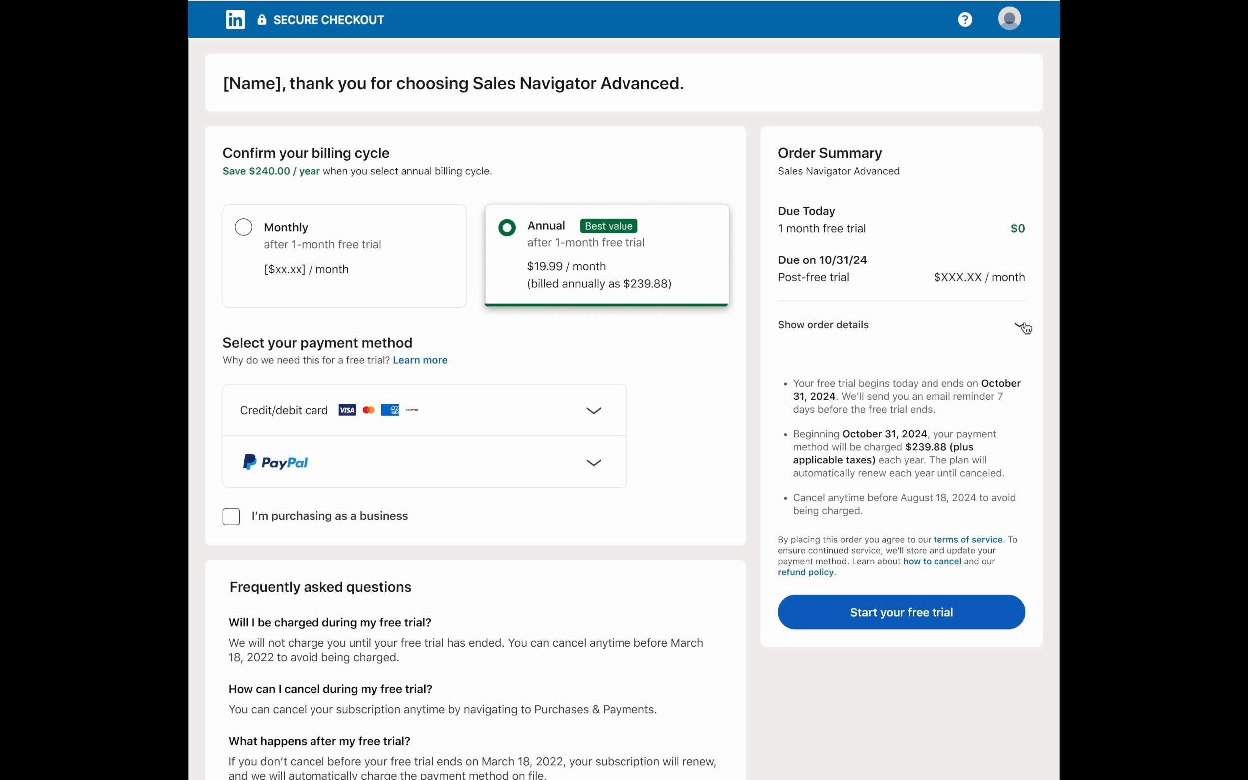
Redesign of the order summary section. That’s the part of the checkout page that shows the products a user has selected, the additional costs and discounts, and the total cost for the purchase.
What Was the Original Experience?
Everything on the checkout page had been designed to keep the purchase button as high up as possible. The thought at the time was that the farther users have to scroll down, the more likely they were to abandon the checkout process.
So the order summary section was compressed as much as possible to reduce verticality. Unfortunately, that resulted in the information being dense and tough to parse.

Why Was This a Problem?
For users: Hard for customers to understand the information. Can lead to frustration, loss of trust, and missing the benefits being provided to them.
For business: That confusion and frustration can lead to lower conversion rates and lost revenue
Hypothesis
If we make the order summary clearer for users, where it’s easier to understand the benefits they’re getting, there will be less drop off in purchasing (which will improve revenue)
Project Start
Project Planning
For each of these projects, we started by figuring out the details of two key strategic areas and creating PRDs for the project.
The logistics of the project: Defining the problem, goals, constraints, timelines, and deliverables
The testing process and results: Planning instrumentation, testing method (Chameleon vs TREX), what outcomes would be considered successes or failures, and what thresholds would the experiment need to meet to ramp to GA
Researching Previous Work
After establishing the plan for the experiment, I needed to understand the current component and the user needs. I started by reviewing the design docs, PRDs, and current user feedback on the feature. With that information I was able to establish a baseline understanding of the jobs to be done, pain points, and reasoning behind previous design decisions.
Usability Audit of Current Component
I took a look at the order summary to identify what were specific pain points that could be addressed.
Low variation in visual hierarchy
Wide visual gap between item and price
All order items are on single lines rather than grouped as product title on top of description
Language was unclear for users
Formatting was not easily scannable
Table and legal disclaimer section look like they’re part of the same component. Unclear because it’s all under one header.
Feature Audit
To get a fine grained understanding of the feature, I broke the order summary into key components. LinkedIn has a lot of SKUs, which can vary wildly based on product selection, so it was important to capture all the pieces to include in the new designs.
Most importantly, I needed to consider the formatting for displaying free trial and the cost once free trial ends. Those two elements have a huge impact on revenue and conversion rates.

Competitive Analysis
I conducted an external audit of order summary sections on other sites to see what patterns and interactions existed. It helped me identify potential Jobs to be Done that we might have missed with the original design.

Synthesis
Jobs to Be Done
After the research and audits, I added two Jobs to Be Done to the existing set for the checkout page. These were specifically for the order summary section, and would act as a north star for the project.

Design Guidelines
I also developed a quick set of guidelines to direct design decisions as we went through the project.
Highest visual priority should be for “what they’re paying for now” and “what they will be paying later”.
An order summary is a final check for a user. A user shouldn’t be surprised by the information there.
It shouldn’t overshadow the other components on the page where users are actually making choices.
Experiment Proposal
Based on the research, we knew what could and couldn’t be changed in the order summary component. and identified four variables to focus on that would likely have the greatest impact. The design work after this would be focused on creating variation focused on these elements.
Free trial emphasis and clarity
Differentiate order summary from legal disclaimers
Trade vertical reduction for scanability
Location of the order summary component (full page vs right rail)


Design Phase
Designing for A/B testing
The design process for A/B testing is dramatically different than most other projects. You’re not necessarily focused on making the best looking design possible. You’re trying to see how specific changes will affect user behavior by isolating the design elements being adjusted. It means that the finished designs will have a lot of elements purposefully not altered so you can get the cleanest data possible for analysis. For example, when testing a line of copy, you might want to change the location but not the styling.
For this experiment, I knew what variables we were interested in changing, but part of the process would be figuring out how to isolate those changes. It also meant having the constraint of minimizing changes to other parts of the component.
Developing Order Summary Templates
With those constraints in mind, I started my design work by developing four order summary template types. These were formats that I had discovered during my competitive research and adapted to our content needs.
Each template could be applied to the full page version and the right rail version.
Explorations
I started doing explorations within those formats to see which were viable with our content, and which would make the most sense to pursue.
There were some that could have been good solutions to continue iterating on, but I discarded because they would included too many changes to the component outside of our targeted variables. They wouldn’t have given us good data in the testing phase.
Iterating Designs
I chose two versions to up-level to full fidelity mocks. Because there was such a quick turnaround time, I needed to develop these designs quickly. I would have a meeting with the tiger team in the morning and afternoon so we could rapidly iterate on the design elements.
Because I was getting more confident about the core elements of the design, I started experimenting with things like the container and interaction elements.

High Fidelity Mocks
The entire design phase had taken place over four days, and gone through multiple iterations. I met with the team and we discussed the finished designs.
The full page version was formatted in the Due today/Due on [Date] template, and placed in a bordered container to match the styling of the other components on the page. The border also helped visually distinguish it from the “what to expect” section below. The right rail had no need for the border because it was visually isolated on it’s own card.
It was fairly successful at accomplishing the JTBD and design guidelines we’d set out, but we weren’t quite satisfied with it. It was still pretty dense and overwhelming because of how much information was being displayed to the user, especially when seen in the context of the full checkout page shown down below.
We decided to take a step back and see if we could come up with a better solution.

Design Pivot
New Direction
I organized a whiteboarding session with the team to see if we could come up with something more successful. We realized the best course of action was to emphasize the first design guideline - highest visual priority should be for “what they’re paying for now” and “what they will be paying later”.
It resulted in us landing on a pattern that hadn’t really shown up in the competitive research, but we thought would work for the content in our order summary.
Collapsed Design
We realized that the best way to simplify the order summary section was to display the two key pieces of information (due today and amount due after free trial), and keep the in-depth information collapsed in a “show more” section.
This allowed the user to meet their JTBD of checking their purchase and getting reassurance, while reducing the noise on the page. They could scan the key pieces of information and expand the section if they really wanted to know more.
Looking outside of checkout pages, the “show more” pattern was something really common and would be familiar to users even if it wasn’t used often for order summary components.
To try and make it a cohesive experience, I used a “show more” interaction that was earlier in the LinkedIn purchase journey as a launch point.

Keeping Testing in Mind
Even with this new direction, I had to keep the designs in line with our testing goals. I still needed to reduce the amount of variables being changed in the new component, even if we were changing the formatting. So I made sure that the order details and copy styling would the unchanged from the original version.
Component Design
I was able to use a large amount of the design work from the previous attempt, so this design direction was able to move fairly quick.
The key thing I needed to develop was the expand/collapse element. I experimented with copy (should it say see details, or show details, for example), alignment, and accordion style chevrons.
An added challenge was designing the expand/collapse element for the right rail and the full page version. The changes in width, placement, and component border meant that the two elements wouldn’t be the same. But the goal was to make them as similar as possible to reduce misleading variables for testing.
Testing Interaction Elements
I felt pretty good about the solutions I had come up with, but I wanted to test the show more/less interactions for validation before moving into finalized designs.
I tested two variations with each layout (full page and right rail) using unmoderated usability sessions on UserTesting. One had the “show order details” element move to the bottom like the full page version, one kept the “show order details” element in place to act like an accordion.
The accordion option was a clear winner. Users performed tasks with significantly less hesitation or confusion. The “show order details” element also improved usability by acting as a header for the section, helping with IA and accessibility.
This meant that I went with different interaction patterns for the full page and the right rail, but wasn’t concerned. The variations would be shown to separate audiences, so they wouldn’t cause confusion or muddy the data.

High Fidelity Mocks v2
After the usability testing, I put together the final mocks. The final test variations would be a control group with no changes, the full page version, and the right rail version.
The final designs fully met our JTBD and design guidelines, and were able to provide significant changes while minimizing external variables. We agreed that this approach would be able to provide the cleanest possible user data during the testing process.
Checks and Handoff
Final Checks with External Teams
Because I’d been working with the tiger team on this project, I already had input from a few key stakeholder groups, but I needed to check with some external teams to ensure final viability before handoff.
Check with legal about copy
Check with design system team about component changes
Consult with a11y team
Responsive Design
Once I knew I had final checks from the external teams, I created a set of mocks based on different pixel break points. This was especially important for the right rail variation, and how the layout would adjust when the screen was compressed.
Presentation and Handoff to Engineering Team
After everything was ready, I walked the full engineering team through the designs and interactions to provide context and answer questions. It also helped us make sure there weren’t any feasibility issues the tiger team’s engineering lead might have missed. I also provided them with a full set of specs for the designs, including styling elements and accessibility points like tab navigation.


Post Project
After Hand-off
The production side of the experiment was a success. We hit our 2 week deadline for the experiment. But that didn’t mean we could sit around. Because there were so many experiments on the roadmap, I had to manage parallel tracks as we moved into the next sprint. I would continue to provide support to engineering during their build, and I would start working on the next experiment.
Impact: Tracking and Testing
This project is currently out of build phase and ramped to a small sample so we can A/B test over the course of 4 weeks. Each group has roughly 800k users from a wide geographical distribution. Results are early, but the experiment is tracking to improve conversion rates by 2.1%. It won’t reach our our revenue growth goal, but will act as a significant step in the right direction.
The biggest result from this testing will be how the right rail performs. If it has significantly higher conversion than either of the full page variants, it could result in us permanently changing the page layout to right rail. That adjustment could lead to a fair amount of follow up work and testing of the other components on the page.
2.1% increase
in conversion rates
Cumulative Work - Seeing Multiple Experiments Put Together
The results of the different experiments aren’t in yet, but all of them are tracking positively. At the end of this project, we’ll need to test how all of the changes will affect user behavior when put together. We’re not even done with all of the experiments, but when combined the checkout page would be completely transformed.
Learnings
This project has been a great opportunity to learn how to plan and manage growth initiatives. Being on the tiger team allowed me to see the full process from strategy to A/B testing and analysis. One of the biggest learnings was how to run iterative designs after they had been shipped and tested. A lot of times there isn’t the resourcing to go back and make changes to live designs for optimization. It was a great experience to see the tangible differences those efforts could make.